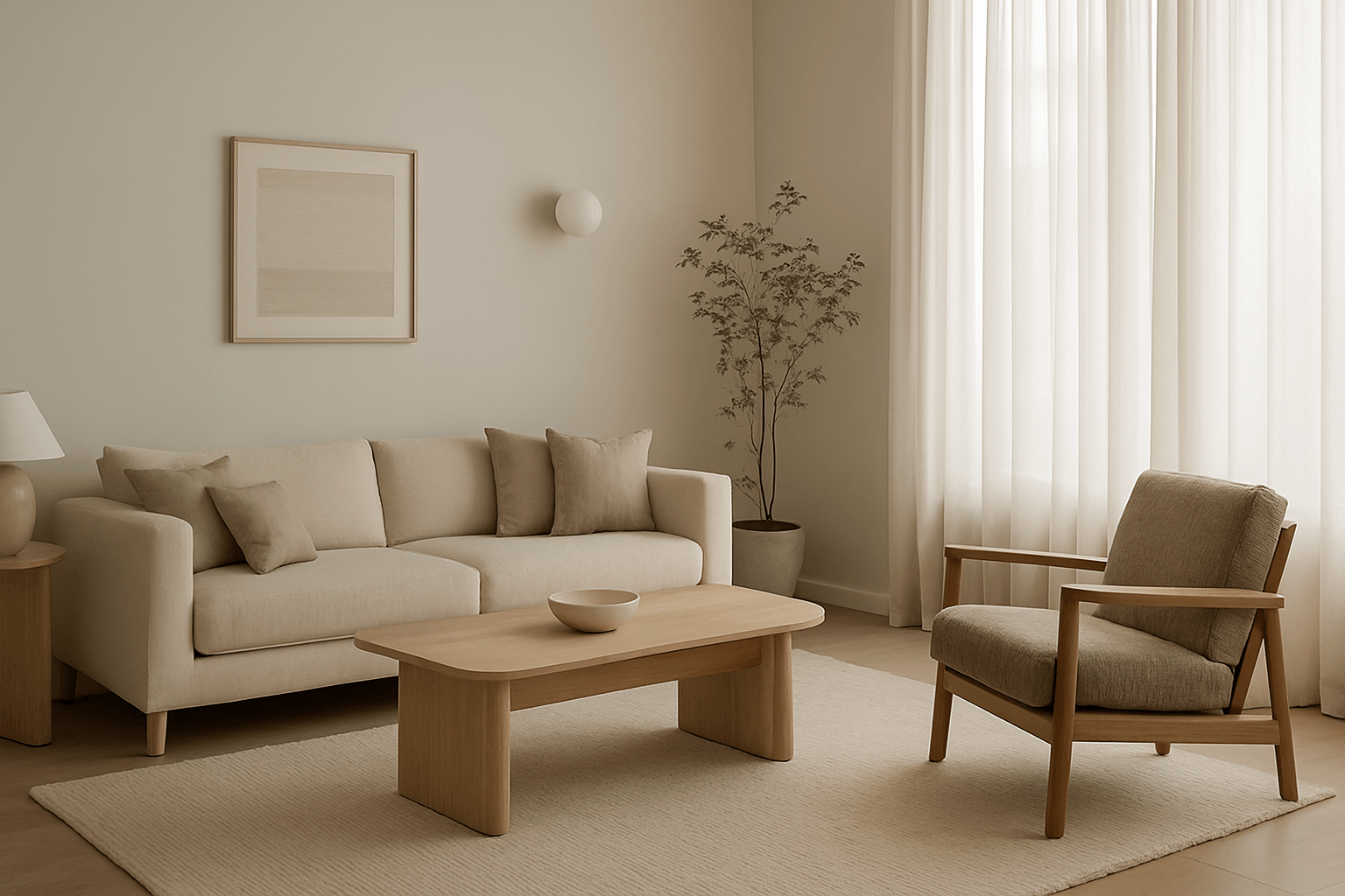
1. Why Neutrals?
Neutrals aren’t plain—they’re powerful. They create a foundation that’s calm, timeless, and versatile. From ivory and taupe to greige and sand, these hues bring warmth without overwhelming a space. They let form, texture, and light take the lead.
2. Building Depth with Texture
A neutral space is never boring when layered with materials. Think boucle chairs, linen curtains, ceramic vases, matte walls, and wool throws. Even subtle differences in finish—glossy vs. raw—can add quiet dimension.
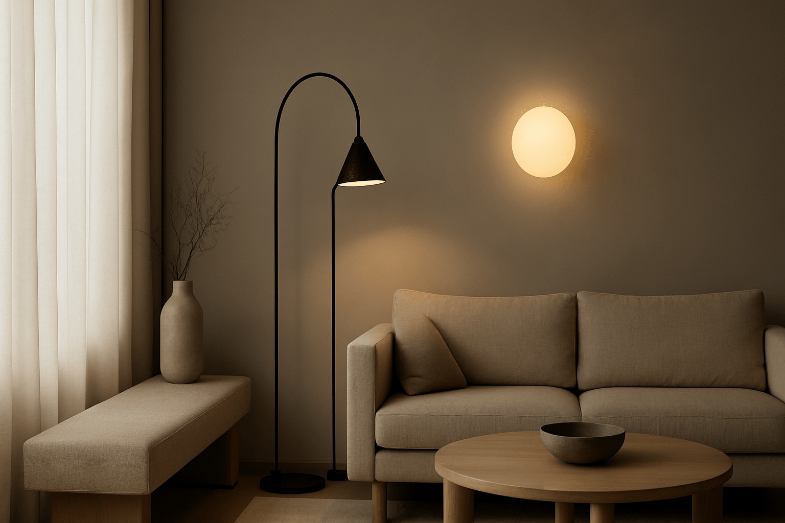
3. Lighting for Soft Ambience
Warm white lighting (around 2700K) flatters neutral tones, enhancing their richness. Use hidden LED strips, wall sconces, or floor lamps to shape shadows and create a cocoon-like effect. Avoid cool light, which can flatten soft shades.
4. Curated, Not Cluttered
Neutrals pair naturally with minimalism. This doesn’t mean empty—it means intentional. A curated gallery wall, a sculptural lamp, or a wooden accent table can become a focal point without adding noise.
5. Timeless Over Trend
Neutrals bypass trend cycles. A beige-toned sofa or stone console feels relevant year after year. They’re the canvas for your evolving taste—and adapt seamlessly as you layer in new pieces over time.
6. Beyond Beige
Don’t be afraid to push past the basics. Olive-gray, warm ochre, and soft mushroom tones can all function as “neutrals” in the right palette. The key is consistency in warmth and undertone.
7. Final Thought
Designing with neutrals isn’t about playing it safe—it’s about creating calm. A quiet space supports a quiet mind, and that’s always in style.