What Is Visual Balance in Interior Design?
Visual balance refers to the feeling of equilibrium in a space — how objects relate to one another in size, shape, tone, and placement. Even in a minimal room with few items, the way those items are arranged can either create a sense of harmony... or feel off-balance.
Unlike symmetry (where both sides are identical), balance is more nuanced. It’s about distribution of visual weight — and mastering it is key to designing minimalist spaces that feel calm, intentional, and cohesive.
1. Understand Visual Weight
Visual weight is what makes some objects feel “heavier” or more dominant in a space than others.
Things that increase visual weight:
-
Darker colors
-
Larger objects
-
Strong geometric shapes
-
Detailed textures
-
High contrast with surroundings
In minimalism, where fewer items are present, each one carries more impact — so paying attention to visual weight becomes essential.
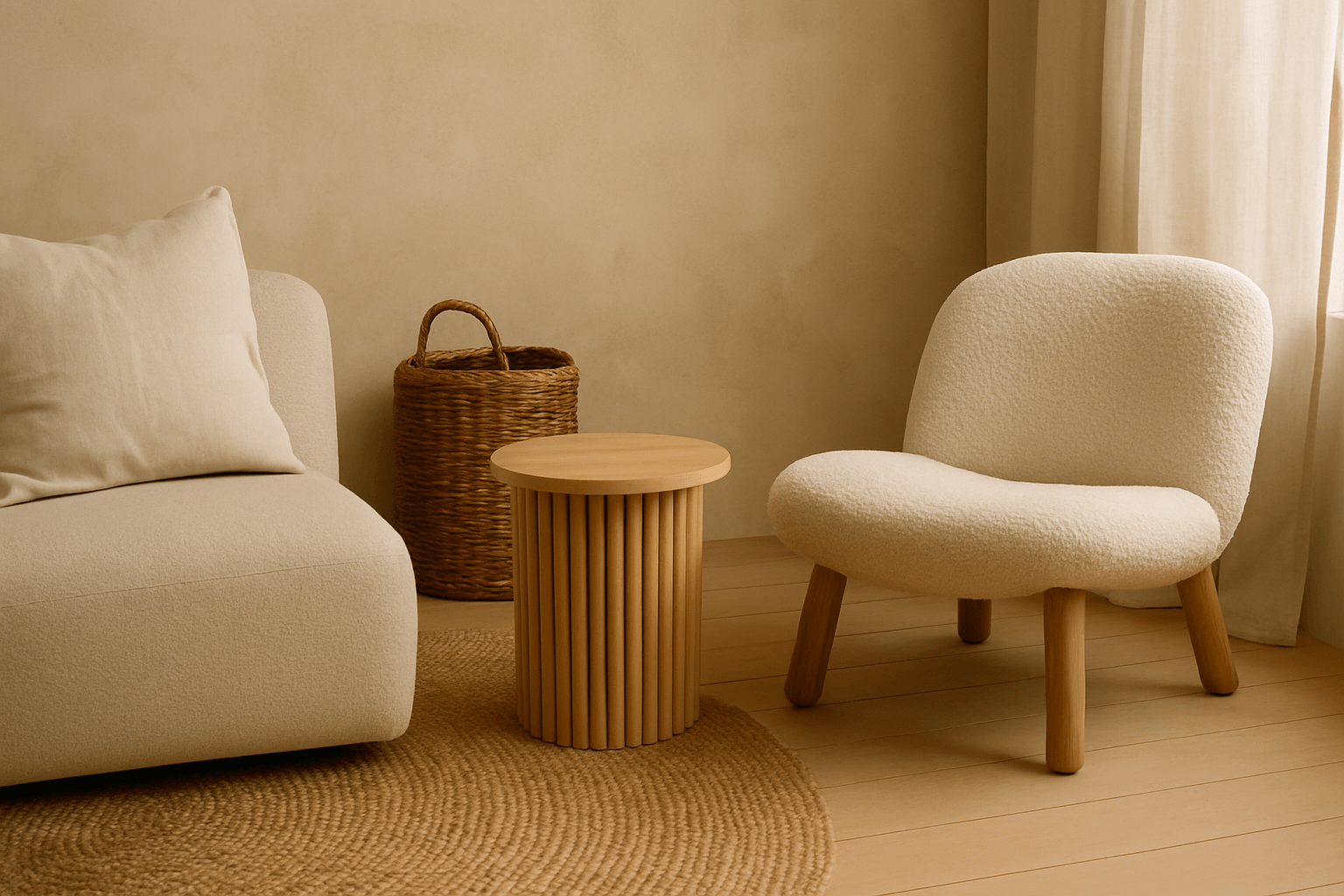
2. Create Balance Through Asymmetry
Asymmetrical balance is more organic and modern. It avoids mirroring objects on either side and instead distributes weight evenly — but differently.
For example:
-
A large sofa on one side of the room can be balanced with a floor lamp and an armchair grouped on the other.
-
A bold piece of wall art can be balanced with negative space and a smaller, contrasting object.
This kind of visual dialogue is what gives minimal rooms rhythm and flow.
3. Mix Shapes and Heights Mindfully
Combining different shapes and heights adds interest without clutter. The key is to group objects so that they complement each other visually.
Try:
-
Pairing a round coffee table with a low, angular chair
-
Grouping tall, slender branches in a vase beside a low-profile sculpture
-
Using layered lighting (floor + wall + pendant) to balance vertical space
Just like in music, design benefits from a mix of high and low “notes.”
4. Use Color and Tone to Anchor the Space
Minimal palettes can still have depth. Use tonal contrast (light vs. dark) to balance a room.
Examples:
-
A dark sofa can ground a pale room
-
A white wall with a matte black light fixture instantly finds focus
-
A monochrome space benefits from one bold tone to provide visual weight
This helps the room feel grounded without overwhelming the minimal aesthetic.
5. Let Negative Space Do Some of the Work
Negative space is a design element, not an absence. Use it to balance heavier or more complex items.
-
If one side of the room has a cluster of objects, leave the other side more open.
-
A large sculptural object can be offset by empty wall or floor space.
-
Minimal shelves should have breathing room — don’t fill every inch.
In minimalism, what you don’t use is just as important as what you do.
Final Thought
Visual balance is one of the most underestimated principles in minimalist design — but it’s also one of the most powerful. When done right, it makes a space feel effortless and complete, even if there are only a few pieces in the room.
Minimalism isn’t about doing less for its own sake — it’s about making each choice count. Visual balance helps every choice work together.