Why Balance Matters in Minimalism
When you walk into a space and it just feels right, that’s usually because of balance—not symmetry or styling tricks, but the thoughtful distribution of weight, light, and proportion.
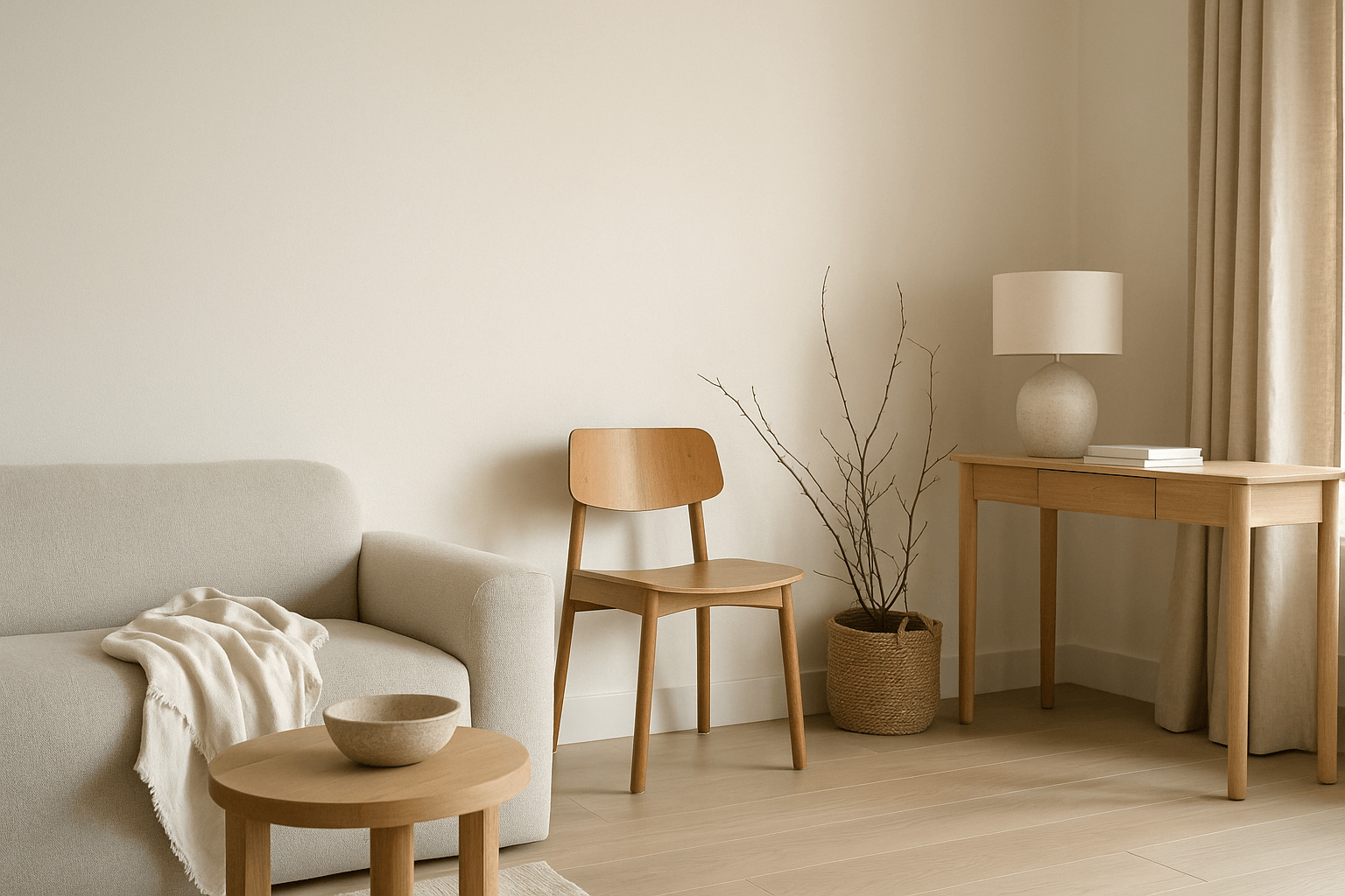
In minimalist interiors, where fewer objects are used, achieving balance becomes more noticeable—and more important. A single heavy piece or an awkward layout can throw off the entire room’s energy.
This is where spatial weight and visual balance come in.
What Is Spatial Weight?
Every object in your home carries a kind of visual and emotional weight, based on:
-
Size and shape
-
Color (dark = heavier, light = lighter)
-
Material (stone feels heavier than linen)
-
Position (low furniture grounds; floating shelves lighten)
Even empty space has weight—it helps balance what's around it.
How to Create Visual Balance in a Minimalist Space
1. Balance Heavy With Light
If you have a dark, solid coffee table, balance it with:
-
A lighter sofa nearby
-
A tall floor lamp to draw the eye upward
-
Empty space around the object to reduce visual density
2. Consider Proportion and Placement
Avoid grouping all heavy or large pieces on one side of the room. Spread visual weight across the space so the room feels grounded and evenly held.
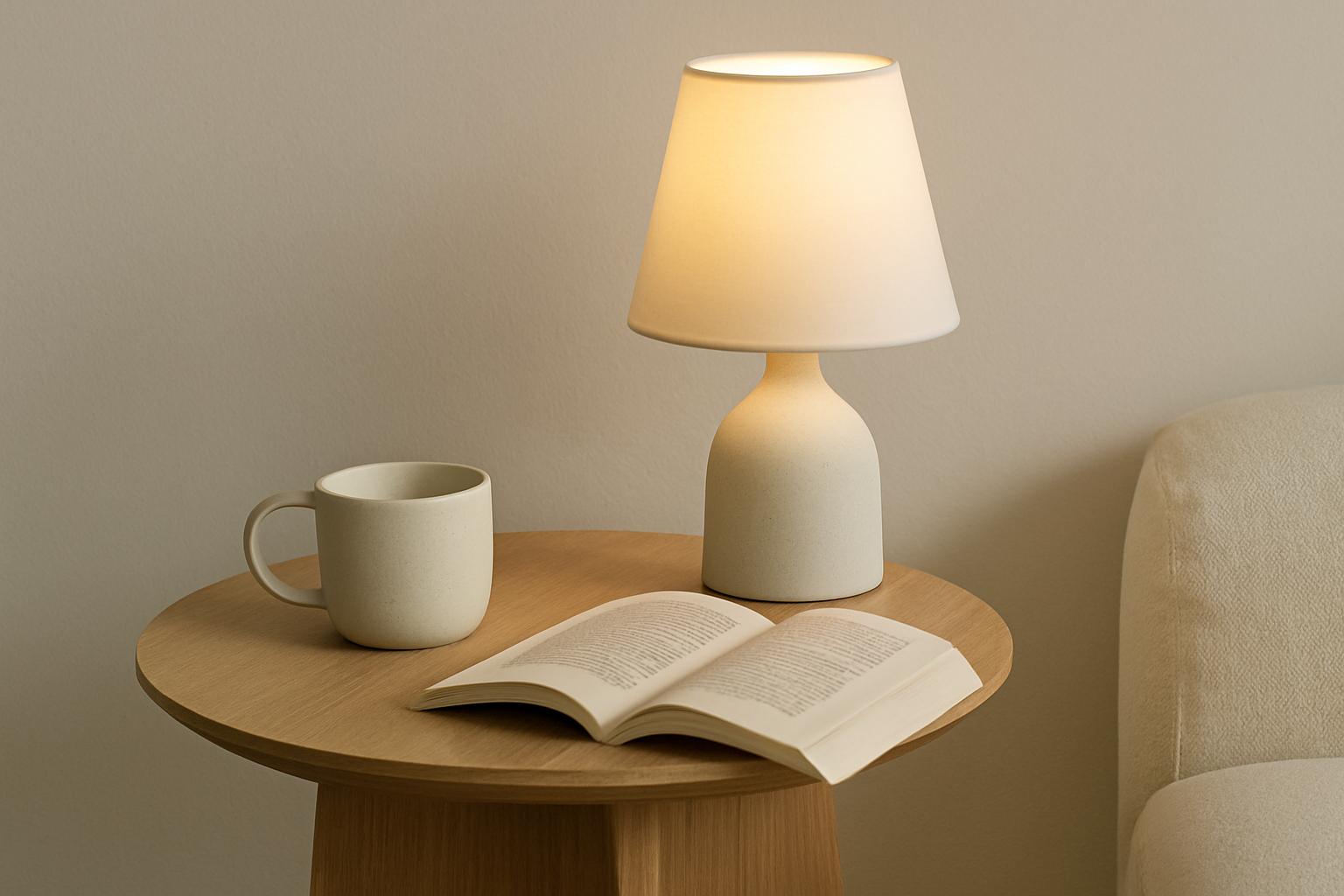
3. Use Negative Space As a Counterweight
An empty wall or unstyled corner can balance a busier part of the room. Think of it as the pause between visual sentences.
4. Layer Vertically
Use low-profile pieces on the floor and draw upward with taller elements like shelving, branches, or wall lamps. This creates balance between grounding and elevation.
5. Mix Materials Intentionally
Pair tactile, heavy materials (like wood or stone) with soft elements (linen, cotton, paper). This contrast keeps the space from feeling too “dense” or too “floaty.”
Mistakes to Avoid
-
Stacking all weight on one side: Creates visual imbalance and restlessness
-
Too many floating pieces: Makes the room feel untethered
-
Ignoring floor space: Visual weight should be distributed from floor to ceiling
-
Overusing symmetry: Can feel stiff; aim for balance, not perfection
Final Thoughts
Minimalism isn’t just about less—it’s about how the less is arranged. When you understand spatial weight, your home becomes more than beautiful—it becomes calm, clear, and emotionally supportive.
Let the objects in your home speak softly. Let their weight be felt—not forced. And let your space hold you in quiet balance.