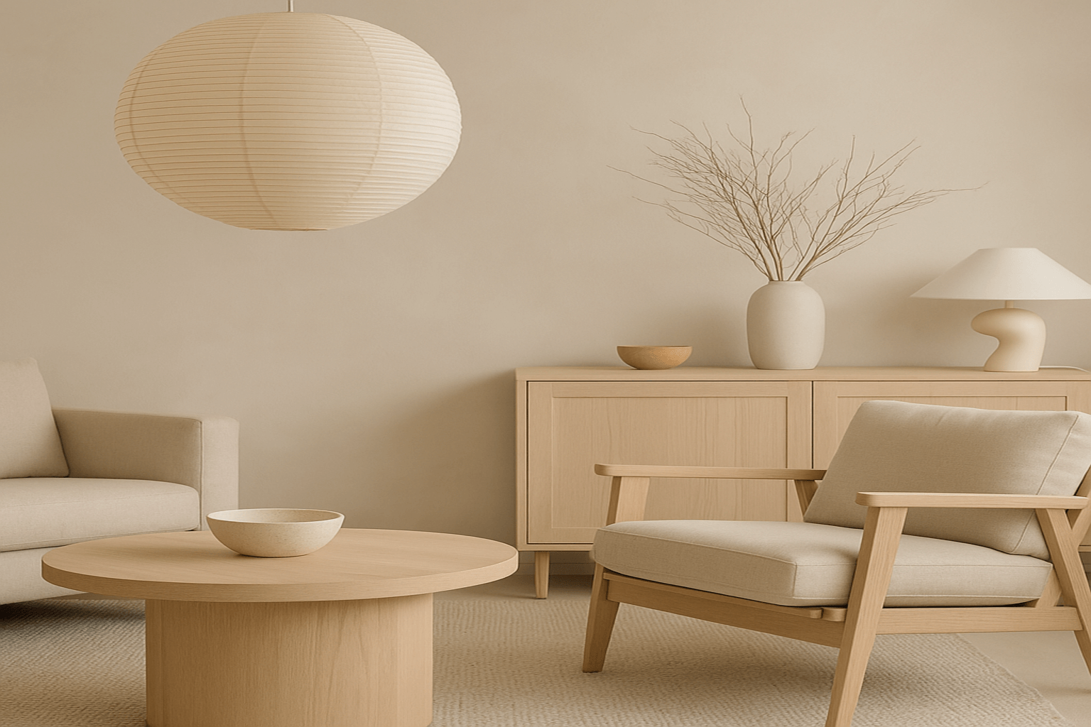
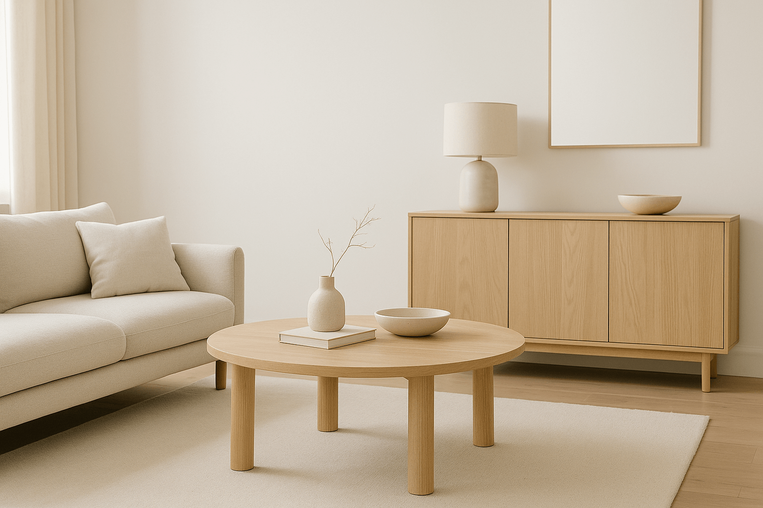
Why Empty Space Matters in Minimalist Design
In a world that often tells us “more is better,” minimalism reminds us of a powerful truth: what’s not there is just as important as what is.
Empty space—also called negative space—isn’t a design flaw. It’s a design feature. When used intentionally, it brings calm, clarity, and balance to your home. It gives objects room to breathe and helps your space feel open, grounded, and focused.
The Psychological Effect of Space
Studies show that clutter can cause stress and mental fatigue. By contrast, empty space gives the eyes a rest and the mind a moment of peace. It also:
-
Makes rooms feel larger
-
Highlights materials, texture, and light
-
Creates a rhythm between “filled” and “unfilled” zones
In short: empty space is not absence. It’s breathing room.
How to Use Empty Space with Intention
1. Leave Wall Space Blank
Not every wall needs art. Let certain walls remain bare to draw attention to nearby textures, architectural lines, or lighting.
Pro tip: In a room with art, hang one statement piece and leave the rest unadorned for maximum impact.
2. Float Furniture Away from Walls
Pull furniture slightly away from walls to open up the floor plan. This adds visual depth and allows light and shadows to play more naturally.
3. Use Fewer Objects, More Thoughtfully
Rather than filling shelves or tables with multiple items, choose one or two purposeful pieces and give them space around and between.
4. Let Light Fill the Gaps
Position furniture and decor to work with natural light. Allow soft light to wash over empty walls, tabletops, and floors—it enhances the mood without adding visual clutter.
5. Design for Flow, Not Fill
When arranging a room, prioritize ease of movement over complete coverage. A single, uninterrupted walking path can add more harmony than a cluster of small rugs or filler furniture.
Common Mistakes to Avoid
-
Thinking empty space needs to be fixed
If it feels calm, leave it be. -
Over-accessorizing “dead” areas
Corners don’t need tall plants unless the space calls for it. Sometimes silence speaks louder than styling. -
Fear of “not enough”
Trust that less can truly be more. When used well, empty space becomes a feature—not a flaw.
Final Thoughts
Empty space is not a gap in design—it is the design. In minimalist interiors, what you remove often holds more power than what you add.
Allow your home to feel intentional and at ease. Give your objects room to be noticed. Give yourself room to breathe.