What Is Monochrome Minimalism?
Monochrome minimalism is the practice of decorating your home using a single color or tonal palette, layered with variations in shade, texture, and finish. It’s not about everything being exactly the same—it’s about subtlety, depth, and restraint.
This approach brings visual harmony and a soothing, cohesive feeling to your space, making it ideal for minimalist interiors.
Why Monochrome Works in Minimalist Design
-
Reduces visual noise: A unified palette calms the eye and helps your space feel more open and intentional.
-
Highlights texture and shape: With color minimized, texture becomes the focal point—linen, wood grain, ceramics, and soft matte finishes stand out more.
-
Creates a timeless aesthetic: Monochrome rooms age gracefully and are less likely to feel dated.
Choosing Your Monochrome Palette
You don’t need to stick to stark white. Monochrome minimalism works with a wide range of tones:
1. Warm Neutrals
Think beige, oat, greige, or taupe. These tones feel cozy and grounded, perfect for natural materials and soft lighting.
2. Cool Greys
Slate, charcoal, and silver tones bring a more modern and sleek look, great for stone, metal, or concrete textures.
3. Soft Earthy Tones
Clay, sand, and mushroom hues create a grounded yet elegant base, especially in Japandi-inspired spaces.
4. All-White (with variation)
White-on-white works beautifully when you vary undertones—cool white walls, warm white textiles, matte and glossy finishes, etc.
How to Layer a Monochrome Space
Vary Textures
Use linen, boucle, ceramic, raw wood, and stone to create tactile interest.
Play with Light and Shadow
Lighting will add depth to flat colors. Floor lamps, pendant lights, and natural daylight all help shift the mood across the day.
Use Tone-on-Tone Accessories
Instead of contrast, try layering a deeper or lighter version of the same base color for visual richness.
Incorporate Natural Materials
Even in a monochrome palette, wood, wool, and handmade items will keep the space feeling organic and not overly sterile.
Where to Use Monochrome Minimalism
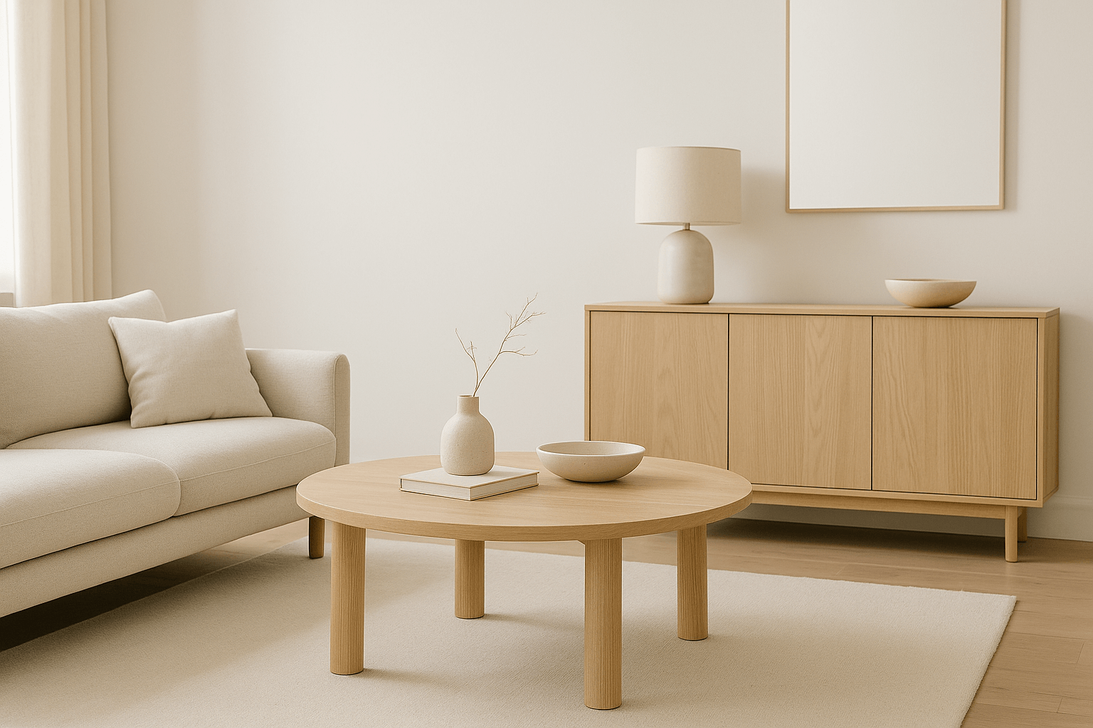
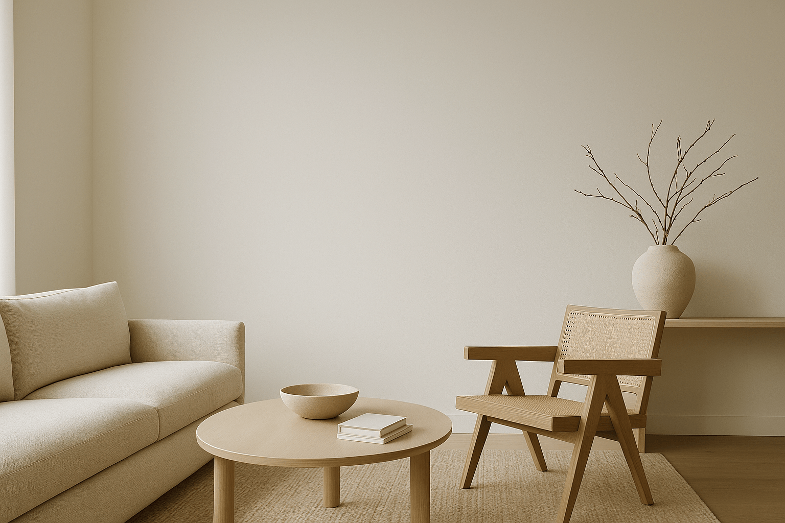
Living Rooms
Soft tone-on-tone sofas, a neutral rug, and light wood furniture form a peaceful and welcoming layout.
Bedrooms
White or beige bedding with layered throws and subtle contrast in cushions for an elevated sleep sanctuary.
Kitchens
Cabinetry, countertops, and walls in the same tonal family create a sleek and spacious feel.
Bathrooms
Think all-stone palettes or light grey tiles with matching hardware and textured towels.
Common Mistakes to Avoid
-
Flatness from lack of texture: Always incorporate variety in materials and finishes.
-
Too cold or clinical: Add warmth through lighting and soft materials.
-
Forcing exact color matches: Slight variation creates depth—don’t obsess over identical shades.
Final Thoughts
Monochrome minimalism isn’t boring—it’s refined, considered, and deeply calming. By choosing one tone and layering it thoughtfully throughout your space, you create a home that feels curated, grounded, and effortlessly elegant.
Less contrast doesn’t mean less impact—it means more intention.